Showing posts with label Theme Park Environment. Show all posts

Monday, October 3, 2016

The Theme Park Environment: Physical Paths

And back with another short environmental post this week after the big double attraction plan post last week.

The first post of the series at the start of the year discussed the concept of the significant of the urban plan to the experience of the theme park. The second post this summer discussed weenies and visual sequence and how they keep us moving in the park.


This time I am going to briefly mention the pair concept to the visual sequence of the paths, the physical sequence of the paths.

This is more than just the concepts discussed in the previous posts because those detailed both the overall planning layout of the paths and the visual effects of the paths, not the actual layout and experience.

There are two major elements I want to mention. The effect of physical compression and release and pointless paths and nooks, as well as one less used element, parallel paths.

First, the effect of compression and release is overwhelmingly similar to the visual compression and release that I discussed last post, but is about how you feel, not what you see. Admittedly, they are basically the same result. When space compresses around the path you are on, you want to keep moving to the adjacent open and released area. One of the best examples is the entrance to Disneyland and the Magic Kingdom. The exact sequence takes us through the compressed turnstiles, the open plaza in front of floral Mickey, the compressed train tunnels, the open Town Square, the compressed Main Street, and finally the open Hub. This alternating character of space directs us and influences our movement. We are not really meant to stay in the compressed moments of the sequence and we physically do not want to when that nice bright and open space is just ahead.

This tool should be used throughout parks to create individual spaces and promoted movement. I dare to say it can't really be overused as long as it does not becoming an overtly repetative sequence of similar spaces. The distribution of scale and scope, like the vastly different spaces along that entry sequence I mentioned, help break us the intentional design choices and make it less obvious that we are being affected.

This is key to the environment, and something that is basically prevalent in every single theme park, regardless of how intentional it is, because it is just a basic element of architectural and urban design. Streets and traditional architecture do the same. Public plazas and squares share sequence with the narrow roads that lead to them. Foyers and hallways mediate the movement through a house from main room to main room. Its a fundamental experiential design tool.


Next, my concept of pointless paths and nooks references the many side areas and lesser used paths of the parks that are unique. Everyone has their favorite little side path of the parks, a lesser populated area that has its own unique character. The former Court of Angels, the Frontierland Boardwalk, the Rose Garden, the depths of the World Showcase pavilions. These minor elements of the circulation system of the park would be very easy to leave out in favor of running every guest through the main wide pathways. Logistically, that would probably be the obvious approach but it prevents diversity of experience and complexity of environment.

Also, an environment with a single path logically does not make much sense in relation to the reality of the spaces they are emulating. We forge paths and cut corners around the main thoroughfare all the time, so the thematic spaces should do the same. But the more important consequence to these side areas is that they help give the illusion of the increased space and depth to the world we are exploring. Every time we see a path break off we are inclined to believe there is more world beyond and more to explore. If we all walked down the same single path from point a to b, we would have seen it all and known that we saw it all. These side spaces are key to the illusion of the themed space being real.


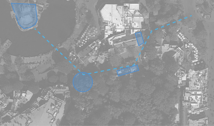
In addition to those two tools, there are a few others that are somewhat less used. My favorite is the idea of parallel paths, that there can be multiple parallel paths of movement through a space that can all look to and reference each other. The best example is along the Rivers of America in both American parks. In Magic Kingdom's Frontierland, there is the storefront path along the buildings, which is separated from the main pathway through the middle, which is separated from the boardwalk along and over the river. At Disneyland, there is the path along the border of New Orleans Square, separated from the tiered walkways along the river, each separated from each other. In both cases, it works just like the pointless paths premise but creates the illusion of choice and diversity while keeping us moving on the same path. We can see others on the other pathways and understand that as diversity of experience all in the same setting with the same start and end.


So based on those ideas, I am interested in what your favorite little side area of the parks is? What pointless path do you enjoy exploring the most while in the parks? Let me know with a comment below. 

Next week I am going to try to be back with another attraction plan post. Let me know what you want to see next. 

Tuesday, August 9, 2016

The Theme Park Environment: Visual Sequence

After a much too long break, I am back again with a discussion post about the environmental design of the theme park typology. This began with a post back in February about the urban plan history of the theme park, specifically Disneyland. I explored the history of the layout of Disneyland, the development of the hub and spoke layout, and discussed the modern form of the theme park in comparison to the traditional model.

If you have not read that or need a reminder, look over that first to get an introduction to the concept and the material that I have covered so far.

This post is going to be the first of many smaller posts in the series that describe a specific environmental design factor.


Visual Sequence of the Theme Park

The urban plan discussed last time goes along way to defining how guests experience and move through a theme park, but it is an exercise in plan and layout, not perspective experience. The actual movement through the park is more dictated by the visual sequence of elements that compels the guests to circulate through the defined urban plan. This visual sequence is defined by a lot of little effects and tools that are present in the best parks. More comprehensively, it is by the joint effect of all the environmental factors that I will talk about in this series, but the visual manipulation of space I will discuss here is a huge element.

The most commonly known element is the park icon weenie. This is fairly common knowledge and has been talked about throughout the history of the theme parks. Every park has one, or at least tries to have one. We see them most obviously as architectural icons for the park that draw us from the entrance towards the center of the park. They're used as marketing and identity because they are what we see first and best at the park.

The true value of the central icon weenie is for overall park navigation, not just drawing guests into the park. A central icon allows the guest to relocate themselves and find their way from anywhere in the park. It is a beacon to lead back to the center of the park and start a new adventure. This is usually a factor of less than succesful parks, along with the urban plan that placed the icon. If the weenie can't be found of does not actually provide a navigational center, then the park is much harder to experience (Disney Studios Paris).

The central icon is not the only application of weenies. The concept extends to the entrance ways to many lands in the parks, most specifically the castle parks. Each land from the hub has a defined entrance with an icon that draws you in and provides reference. Tomorrowlands have the Astro Orbiter on line with the hub entrance and act as the center node to the land. Fantasylands have the same results with the Castle and Carousel. Frontierland looks through to the river the the Steamboat passing by. All of these have the same effect as the main weenie. Again, this is a problem with unsuccesful parks because there is difficulty knowing where lands are defined and problems spreading crowds out to find the attractions of the park. Hollywood Studios is an examples, where very little of it is actually visible from the central hub area, making the navigation and balance of the park a problem for daily guests.

Moving past weenies to the actual technical idea behind them, the use of view termini is prevalent throughout all parks. Simply, a view terminus is the idea that there is something to see at the end of every path. It is an architectural concept that relates to the planning of a city. Historically, churches and other important social locations were located at the end of major streets and we connected in a network of visible paths to aid navigation. Theme parks adapt this same idea by attempting to purposefully place elements at the end of a visible path that draws you forward and then allows you to network to the next location. This idea does not have to apply to only the defined end of a defined path, but any kind of directed view that leads farther into the land. Think of Adventureland in Disneyland if you are familiar with it. From past the entrance bridge, the view of guests is limited to the left and directed right at the Jungle Cruise building, signaling that they should head that way, instead of to the right, which is a secondary path to Frontierland and therefore does not really have as much of a drawing feature. Then from the center of Adventureland, guests then see the treehouse at the end of the path, moving them along. From their, they can see Tom Sawyers Island and possibly a passing ship framed perfectly to the right, leading into the next land. This sequence continues throughout the park, creating a network of points. These view termini are far more effective than if the placement of views and buildings was not considered. If at the entrance to Adventureland, you couldn't see anything expect jungle to the left, would you feel as drawn to head that way? And if the treehouse didn't obviously say that there is somthing here to see, you may not be as inclined to continue.


Some of the most significant view termini are the many architectural and natural icons of the parks, and these also usually happen to be the most succesfull attractions, entirely because their placement requires us to notice and be drawn to them. Similarly, attractions that falter and do not see similar crowds are usually buried in the middle of an environment, at the end of no view. A good example is the relative unpopularity of Stitch's Great Escape and the Monsters Inc Laugh Floor compared to other attractions in the area. They are parallel to the path and do not terminate any view, so they are easy to pass by.

Another tool that helps create this experience network is the compression and release of views as you transition through the park. This is paired with the compression and release of space, which is a future topic. Basically, the sequence of moving through the park alternates moments where your view is compressed, usually pointing you to either a view termini or hiding something you should not see yet, and then your view is expanded to reveal the full extents of the themed environment. Then it happens again, and again as you move through the park. Back to Adventureland for the example. You start in the wide open hub, where you can see glimpses of many attractions and many lands, so your environment is not focused in yet. Then you move towards Adventureland, through the vegetation, and across the bridge with the gateway. You are tightly focused in here and immediately cannot see the expanses that you just could in the hub. This continues past the Tiki Room on the left until you can see the Jungle Cruise building and a large open area ahead of it. Then, we are in the public pathway stretch of Adventureland, where we are no longer narrowed and can in fact again see many attractions and many areas of this one land. The area around the treehouse and the buildings on the left and right of the path again narrow our view as we transition to Frontierland, which then expands into the super open riverfront, where we are then drawn by a multitude of view termini icons. This land is one of the best examples of this, but most lands and transitions attempt it. So many land transitions in theme parks use a narrowed path that constricts flow, which at first seems to be illogical since these transition paths will get alot of traffic. But by narrowing them, guests are visually encouraged to move on the the next point of expansion. More on this when I talk about physical compression and release.

One last element that ties into that alternating sequence is that many themed lands, even in moments of open vision, restrict the overall scope of the environment by shortening the distance you can see from end to end. Giant open lands feel less appealing than lands that are divided into more modest moments, connected in their own sequence. Fantasyland is Disneyland is a good example because it focuses itself into multiple defined areas that have visual linkages, but not real connections. From the castle courtyard area, you can't see across to the Alice area or the Matterhorn Challet area because trees and buildings block that view. The other more subtle elements from above guide us along without having to show us everything ahead, like Monstro from the Storybook Canal Boats. Similarly, you don't get a clear view of Small World until you are clear into the parade corridor path which terminates at the Small World facade.

Just next door is an example of how this is a problem in my opinon. Toontown felt too open to me because it allows you to look all the way across the land and see anything and everything that would draw your interest. There is no mystery that requires you to turn a corner. Maybe it works since its a small land, but it still can stand as an example of the difference between open lands and divided lands.

In my view, many area of California Adventure have this last problem. In a few places, it felt like I could see too much and that this both didn't make me want to explore as much as I should and that I was not focused into one thematic environment. Examples are Paradise Pier for being able to see too much at once and Cars Land for not being focused in one space. All around the Pier loop, you can see the entirety of the pier loop. There are not really moments that pull away from the land, though Paradise Garden Grill comes close. And in Cars Land, though what I could see around me was impressive, I felt like it was too open and expansive. Seeing Tower of Terror, Bugs Land, and California Screaming from various points didn't allow me to narrow into the single world. This is probably a vegitation problem which is both because it is new and because it is meant to be a flat desert town. No allowance for thick green berms that subdivide and restrict views. But that's not a huge issue since the land does many other things, like view termini and sequence, right. And one of the best compression and release of view moments is at the rock tunnel entrance from Pacific Wharf. This perfectly sets guests up to enter a new world.


A Conclusion and Discussion

In my interpretation of the experience of the park, all of these tools come to together to visually suggest movement and exploration more effectively than a big open park, where there is no visual order or mystery. Therefore, understanding these visual tools is vitally important to the implementation of a theme park urban plan.

I am going to expand on this in the new post of the series which is going to focus on how paths are laid out and how the physical arrangement of circulation affects how we experience the park.

My question this time to start discussion is if you have ever noticed yourself being driven by any of these factors. Do you remember any particularly effective termini that compelled you to more through the park or any momenets of visual compression or release that really stayed with you?

For me, the transition to Frontierland from Adventureland stays with me because I timed it perfectly. Just as I first turned the corner from the Treehouse and saw the Rivers of America, the Sailing Ship Columbia was passing through the framed view, perfectly drawing me into the new land. What about you?

Leave a comment, share with anyone else that may be interested, and check back next week for another post!


Wednesday, February 10, 2016

The Theme Park Environment: The Urban Plan

The Theme Park Environment

If you are reading this, then chances are you like Theme Parks, and specifically highly designed parks like those of Disney and Universal. Each of us may have a different reason for our love, but for many of us, it is not just the rides, but the total experience of the park. A theme park like Disneyland is much more than just a passageway from attraction to attraction because it is of itself an attraction. This park experience is built out of a theme and attention to detail that creates a place worth being in, a place that you actually want to be in, and a place with a unique character. That’s why for many, attractions are not necessary to an enjoyable day in the parks, so long as their experience of the park is transformative from everyday life.

This transformation, or envelopment of theme, is dependent on the design, or urban plan, of the environment. This urban plan is the design philosophy that provides the structure to the public spaces we inhabit. For instance, we know that not all theme parks are made equally; Disneyland and California Adventure share some characteristics, but feel entirely different, and this is because of the application of different planning strategies, such as pathway widths and the park layout. This is a good example that I will come back to over and over since it is such a close comparison.

These little design elements sum to create the wholly unique environment that is a theme park, many of which we may not notice or not see as significant. I have identified about a dozen of these elements that I see as most important to the success of a theme park, and will be discussing a subset of them in each post, each time grouped into a theme, such as visual motion, scale and density, and vegetation.

In this first post, I will look at the overarching idea of urban planning and the layout of the theme park typology, which nearly all of the future ideas will fall under.


A New Urban Planning Typlogy

Disneyland is one of the most regarded examples of modern Urban Planning. That’s a big statement for an architecture student. But it is not my statement, but that of James Rouse, who said that Disneyland, when analyzed by “its performance in relationship to its purpose”, is “the outstanding piece of urban design in the United States.” He is not alone with his appreciation of the design of Disneyland. There are many academic essays about the design and significance of the design of original Disneyland, mostly focusing on the charming design of Main Street and the innovation of the overall masterplan strategy. Main Street USA was even included in an architecture book of great streetscapes of the world that was used in one of my classes. In all cases, Disneyland is thought of as a piece of design that stands unique in history.

It built upon a traditional form to redefine a kind of design that is now a worldwide phenomenon. There were parks and analogues to theme parks, such as World’s Fairs, but Disneyland on the whole created a new form of urban design. It is filled with unusual design needs, such as a single entrance, theatrical style facades, private service areas, and large complicated rides on the interior. A theme park became a new urban typology.

Before going much farther, we should look at what an urban plan encompasses in relation to a theme park. Urban planning refers to the design of large scale built environment with the goal of creating public space that is both functional and full of character. A successful planned place, of any scale from park to city, has a unique identity that does not compromise its ability to work for the needs of the user. An urban plan is crucial to manage how space develops over time so as to maintain the identity and use.

This definition does not differ when applied to a theme park, and in fact becomes more significant because function and theme are vital elements of a working park. Imagine a park that works but completely lacks any character. Or the opposite, a park so unique that it prevents it from truly working. I see examples for both cases, such as original DCA, which is the most relevant example for how the theme park urban plan can have faults.

Additionally, the comparison between how a city is to be designed and how Disneyland was designed is more obvious when you think of Disneyland as an urban city with the same challenges. It likewise had to provide a variety of services and goods to its residents. It needed public parks for relaxation and cultural centers for entertainment and learning. It had to safely and reliably move people through a complex environment. It even had similar transportation issues, since so many attractions of original Disneyland were just forms of transportation through this urban city. No matter that the city was the Old West or the deep jungle, the same issues applied.

Therefore, the tools of the theme park urban plan are nearly always the same as that of a city. There is nothing special to it besides creating a practical public space where you want to spend time.

Since the urban plan proscribes the way built public space is arranged and detailed, the physical layout of buildings and pathways is likely the most important element and most identifiable trait of the typology. So that is where we begin in this first discussion.


The Development of a Theme Park Layout

The physical layout of buildings in a theme park is the most defining characteristic of how it is to be experienced, and a theme park has a definitely unique layout. Today, park layouts like the defining hub and spoke or the ring (or the random layout) seem like obvious strategies, but came about through a long process of development by the original Disney legends that started this kind of project from scratch.

Luckily, we have great records of the development process of the original Disneyland, documented in the many concept drawings and paintings we have from the years before the park. These works exhibit the expertise of many designers including but not limited to Marvin Davis, Ken Anderson, Harper Goff, Peter Ellenshaw, John Hench, and Walt Disney. Their work resulted in a series of plan that inform us of some interesting choices about how the park was meant to be.


Original designs for the park lacked the formal structure of the final product and had a rambling natural layout. These plans, many drawn by Harper Goff like the one above, were intended for the Riverside Drive plot across from the studio, so the limited size dictated many decisions. These original concepts today look more like small cities with recreation parks than a theme park because, as far as I can tell from the limited aerials, they did not yet have detailed and diverse themed areas, instead recreating standard planning elements like a fairground or a country village. These theme parks began by synthesizing how real public spaces were designed and built. This was the foundation for what would come, as there are some recognizable elements that carry on.


After Walt’s dreams outgrew the Riverside Drive location, the designers began to expand the scope of their planning, leading to the first attempts at full sized parks with distinct lands. The breakthrough came when art director Marvin Davis created the plan above, the first site plan with a real planning structure: the hub. Previous attempts on the unlimited site continued to be modeled on real cities, so hubs and town squares were commonly included, but not at the center of the park. This was the first to make the town square-like hub into an organizational tool for the park to radiate from, and possibly the first with distinct theme based lands.


This Hub and spoke plan stuck, and Marvin Davis continued its development to create the first drawing that really looks like what we now understand as a Disney park. Its 8 spokes on the central hub included lands we know, but also those that never were like Circus Land and Liliputian Land. It is fascinating just how much of this park came to be, though in a different form. There are over a dozen recognizable attractions shown that made it to opening day. I also have to say that this single drawings is the biggest inspiration for my drawing style, so it will always be one of my favorites. As for the spatial planning of the park, there are a few notable choices that led to modern Disneyland.

First, it is surprising to see 8 whole lands spurring off the hub, each with its own gate, and each of substantial size. This park has perfect symmetry across the north-south axis, which opening and modern Disneyland lacks. Today, Main Street, Fantasyland, Frontierland, and Tomorrowland sit on the cardinal points of the Hub, while Adventureland is tucked into a corner off axis. This has always puzzled me, but this drawing begins to explain it, particularly because this plan shows the other 4 main lands are already in their final locations. This pretty clearly shows me that this formal arrangement of the lands was decided to be final. Adventureland is merely the only of the 45 degree lands to have be built as drawn whereas the others became only pathways into the lands or were never built. This has held true through most other castle parks, where the left side of the park has had two land gates while the right has one. In those cases, the gates are better spaced out and no longer lie on the 8ths, but still follow the same rule. It appears to me that the layout of the modern park is directly resultant from this drawing.


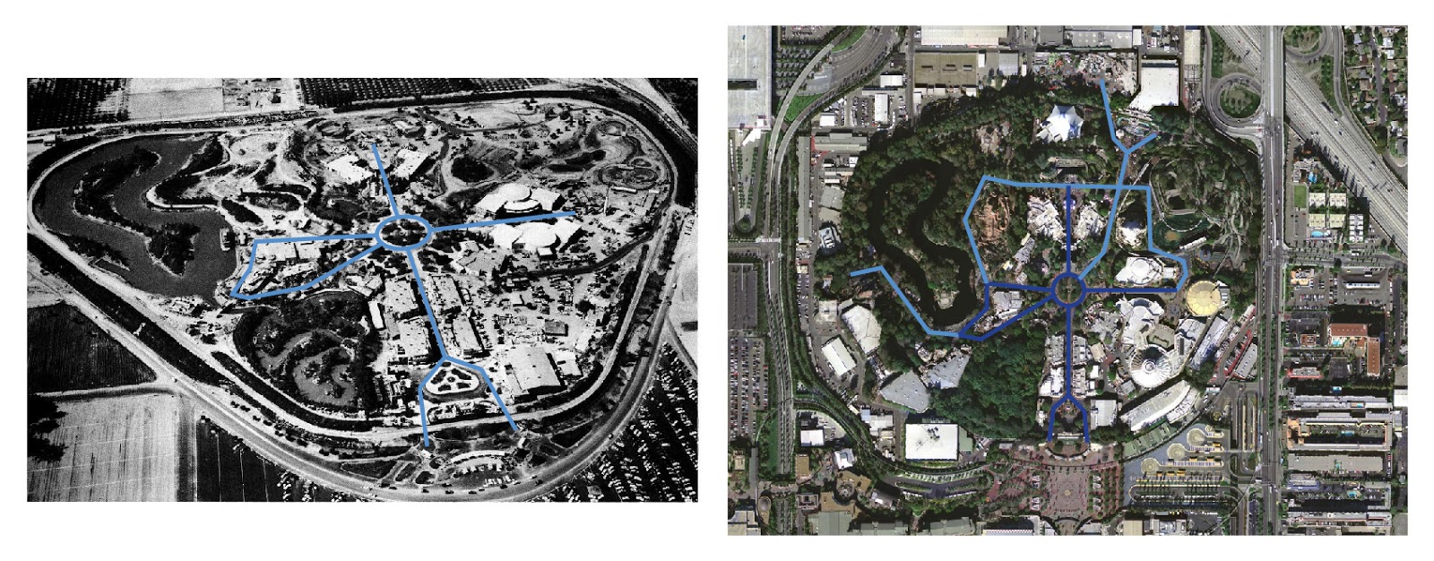
Another interesting thing about the implementation of the hub in this drawing is the limited access between the lands. This is a foreign concept to today’s park, where you can travel from land to land outside the hub, but in this drawing, in future drawings, and in the original built park, this was impossible (though technically Frontierland and Adventureland were joined on the west side). As a thematic strategy, this makes a lot of sense, because it controls transitions by requiring you to go back through the hub. But as an urban planning issue in relation to crowd flow, this decision would likely cause problems. Imagine the bottlenecks at each gate. This was quickly changed at the original Disneyland with the addition of the group of attractions between Fantasyland and Tomorrowland, creating a second ring outside the Hub. All future castle parks were built with this outer ring through the lands. In the comparison diagram above, it is pretty clear how useful this second ring is to increase the functionality of the park.


From that drawing came the iconic John Hench aerial that supposedly was used to sell the Disneyland concept. Visualizing the plan in 3D, it is obvious how much of the final park came from this drawing. Even if not exactly accurate, each land begins to exhibit its unique character in their environmental elements, such as the architecture, the scale and density, the unique variety of vegetation, and the sheer kinetic spirit of the park. These are some of the big environmental elements I'm going to try to cover. This is one of my all-time favorite pieces of concept art.


Finally, the most well-known image is probably Peter Ellenshaws day/night painting of the yet to be built park. The opening day park was mostly accurate to this drawing, minus Tomorrowland and the right side of the park. This plan still shows 8 points on the Hub, though not necessarily 8 lands. This is the most realized example of the true Hub and Spoke park diagram.

This is of course not a comprehensive or fully researched history, but just my observations from a series of drawings about how the idea of a theme park became the modern park layout.


The Modern Park Layout

The Hub and Spoke formal strategy is now the standard of theme parks, and nearly all modern parks in some way have roots here. These include all castle parks, Future World in EPCOT, Animal Kingdom, California Adventure, parts of Hollywood Studios, and dozens of regional and international parks.

The benefits are obvious: a single entrance pathway (that is also a retail corridor), a clear central location for ease of wayfinding (in cooperation with an icon), and a thematic transition space that allows for glimpses into multiple lands. Each of these three benefits are in of themselves useful planning tools to make a better park that I will discuss in future essays.

Also of note is the other dominant theme park layout: the ring or lake park. This is a fairly obvious strategy that places lands in a sequence around a central body of water. These include World Showcase of EPCOT, Islands of Adventure, parts of Universal Orlando and Universal Osaka, Universal Singapore, and likely a few more internationally. These parks have easier navigation, but require more complete transitions since there is no neutral hub.

Last, there is the studio/city style park, which is rare for a reason. Parts of Hollywood Studios and the Universal Parks, especially Hollywood, are like this. These parks grew without a formal urban plan, causing chaotic transitions and complicated navigation. These parks are being fixed where possible to solve these issues.

There is one particular park that I want to mention the urban plan of because it is an unusual but innovative combination that I see potential in. I am talking about Hong Kong Disneyland, which places an expansion ring park around an originally built hub and spoke park. It’s a genius way of controlled expansion, which has been a problem in many other parks. It’s a very cool idea that so far seems to have worked.

Finally, from what we know of Shanghai Disneyland, they are also trying to do some innovation with the layout. The aerials and maps show that this park has pulled the lands back from the hub and placed a new land at the center instead of a traditional hub. This majorly changes the effect of the hub because it is no longer a transition space that looks into each land but its own unique themed space. In effect, Shanghai Disneyland is a strange combined hub and spoke and ring park, with a land at the center instead of a lake. I am extremely fascinated to see how this park works and how different it ends up being.


A Conclusion of Urban Planning

To conclude this essay, I must say urban planning is too big a subject for me to ever really write about completely, because it creates the distinctive essence of a theme park. As I have said, it is a one of a kind typology that had a unique and quick development, yet is always being improved.

In the next essay, I am going to continue to look at how the placement of elements in the plan helps to create something special, specifically the concepts of visual icons (weenies), scale, and density.


A Place for Discussion

Lastly, I had previously said I wanted to make these essays an opportunity for discussion. So this is the first post and I am not all that sure how to do that. So this time I am going to start with some discussion questions, but later posts may have more discussion ideas in the post. And since this post was more history heavy than design, I am going to start simple.

The most obvious concept of debate here is which theme park form do you prefer and why?

But more specifically, thinking about your experiences in varied theme parks, how to you personally see the value of a theme park urban plan?

I’ll post my thoughts in reply comments.

Also, in order to have a good discussion, we need to reach more people! Please share this on twitter or facebook or however you want! Thanks for reading and hope you leave a comment with your thoughts!


Resources

The following books and websites were consulted while writing as either primary sources, general inspiration, or image sources:

   Walt Disney Imagineering: A Behind the Dreams Look at Making the Magic Real

   Designing Disney by John Hench

   The E Ticket Magazine: Issue 11

   The Immersive Worlds Handbook by Scott A Lukas

   http://www.sterow.com/?p=2368#.VqQxMPkrJCA

   http://micechat.com/54592-walt-disney-epcot/

   http://www.justdisney.com/disneyland/disneyland_photo_pages/aerial/Aerial.html