
If you have not read that or need a reminder, look over that first to get an introduction to the concept and the material that I have covered so far.
This post is going to be the first of many smaller posts in the series that describe a specific environmental design factor.
Visual Sequence of the Theme Park
The urban plan discussed last time goes along way to defining how guests experience and move through a theme park, but it is an exercise in plan and layout, not perspective experience. The actual movement through the park is more dictated by the visual sequence of elements that compels the guests to circulate through the defined urban plan. This visual sequence is defined by a lot of little effects and tools that are present in the best parks. More comprehensively, it is by the joint effect of all the environmental factors that I will talk about in this series, but the visual manipulation of space I will discuss here is a huge element.
The most commonly known element is the park icon weenie. This is fairly common knowledge and has been talked about throughout the history of the theme parks. Every park has one, or at least tries to have one. We see them most obviously as architectural icons for the park that draw us from the entrance towards the center of the park. They're used as marketing and identity because they are what we see first and best at the park.
The true value of the central icon weenie is for overall park navigation, not just drawing guests into the park. A central icon allows the guest to relocate themselves and find their way from anywhere in the park. It is a beacon to lead back to the center of the park and start a new adventure. This is usually a factor of less than succesful parks, along with the urban plan that placed the icon. If the weenie can't be found of does not actually provide a navigational center, then the park is much harder to experience (Disney Studios Paris).
The central icon is not the only application of weenies. The concept extends to the entrance ways to many lands in the parks, most specifically the castle parks. Each land from the hub has a defined entrance with an icon that draws you in and provides reference. Tomorrowlands have the Astro Orbiter on line with the hub entrance and act as the center node to the land. Fantasylands have the same results with the Castle and Carousel. Frontierland looks through to the river the the Steamboat passing by. All of these have the same effect as the main weenie. Again, this is a problem with unsuccesful parks because there is difficulty knowing where lands are defined and problems spreading crowds out to find the attractions of the park. Hollywood Studios is an examples, where very little of it is actually visible from the central hub area, making the navigation and balance of the park a problem for daily guests.
Moving past weenies to the actual technical idea behind them, the use of view termini is prevalent throughout all parks. Simply, a view terminus is the idea that there is something to see at the end of every path. It is an architectural concept that relates to the planning of a city. Historically, churches and other important social locations were located at the end of major streets and we connected in a network of visible paths to aid navigation. Theme parks adapt this same idea by attempting to purposefully place elements at the end of a visible path that draws you forward and then allows you to network to the next location. This idea does not have to apply to only the defined end of a defined path, but any kind of directed view that leads farther into the land. Think of Adventureland in Disneyland if you are familiar with it. From past the entrance bridge, the view of guests is limited to the left and directed right at the Jungle Cruise building, signaling that they should head that way, instead of to the right, which is a secondary path to Frontierland and therefore does not really have as much of a drawing feature. Then from the center of Adventureland, guests then see the treehouse at the end of the path, moving them along. From their, they can see Tom Sawyers Island and possibly a passing ship framed perfectly to the right, leading into the next land. This sequence continues throughout the park, creating a network of points. These view termini are far more effective than if the placement of views and buildings was not considered. If at the entrance to Adventureland, you couldn't see anything expect jungle to the left, would you feel as drawn to head that way? And if the treehouse didn't obviously say that there is somthing here to see, you may not be as inclined to continue.
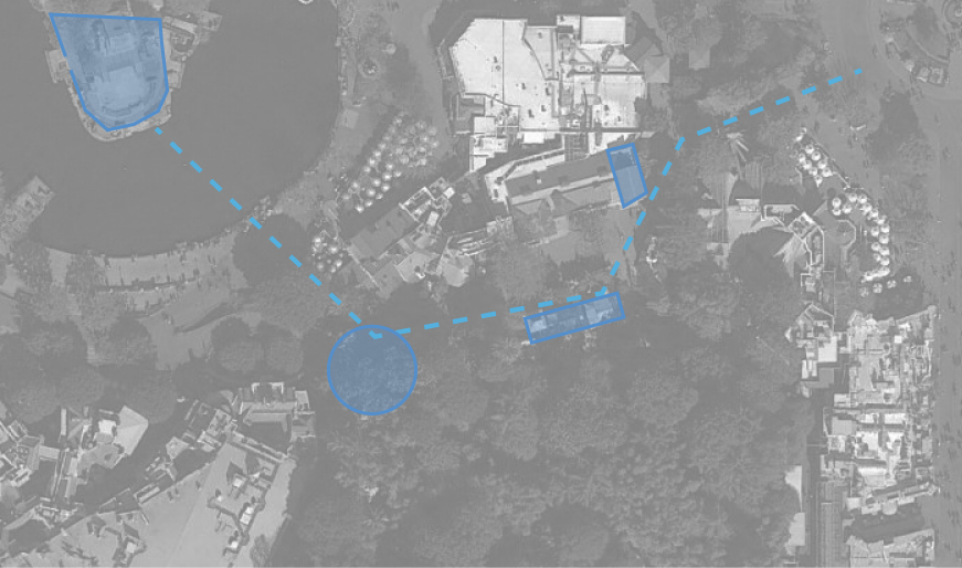
Some of the most significant view termini are the many architectural and natural icons of the parks, and these also usually happen to be the most succesfull attractions, entirely because their placement requires us to notice and be drawn to them. Similarly, attractions that falter and do not see similar crowds are usually buried in the middle of an environment, at the end of no view. A good example is the relative unpopularity of Stitch's Great Escape and the Monsters Inc Laugh Floor compared to other attractions in the area. They are parallel to the path and do not terminate any view, so they are easy to pass by.
Another tool that helps create this experience network is the compression and release of views as you transition through the park. This is paired with the compression and release of space, which is a future topic. Basically, the sequence of moving through the park alternates moments where your view is compressed, usually pointing you to either a view termini or hiding something you should not see yet, and then your view is expanded to reveal the full extents of the themed environment. Then it happens again, and again as you move through the park. Back to Adventureland for the example. You start in the wide open hub, where you can see glimpses of many attractions and many lands, so your environment is not focused in yet. Then you move towards Adventureland, through the vegetation, and across the bridge with the gateway. You are tightly focused in here and immediately cannot see the expanses that you just could in the hub. This continues past the Tiki Room on the left until you can see the Jungle Cruise building and a large open area ahead of it. Then, we are in the public pathway stretch of Adventureland, where we are no longer narrowed and can in fact again see many attractions and many areas of this one land. The area around the treehouse and the buildings on the left and right of the path again narrow our view as we transition to Frontierland, which then expands into the super open riverfront, where we are then drawn by a multitude of view termini icons. This land is one of the best examples of this, but most lands and transitions attempt it. So many land transitions in theme parks use a narrowed path that constricts flow, which at first seems to be illogical since these transition paths will get alot of traffic. But by narrowing them, guests are visually encouraged to move on the the next point of expansion. More on this when I talk about physical compression and release.
One last element that ties into that alternating sequence is that many themed lands, even in moments of open vision, restrict the overall scope of the environment by shortening the distance you can see from end to end. Giant open lands feel less appealing than lands that are divided into more modest moments, connected in their own sequence. Fantasyland is Disneyland is a good example because it focuses itself into multiple defined areas that have visual linkages, but not real connections. From the castle courtyard area, you can't see across to the Alice area or the Matterhorn Challet area because trees and buildings block that view. The other more subtle elements from above guide us along without having to show us everything ahead, like Monstro from the Storybook Canal Boats. Similarly, you don't get a clear view of Small World until you are clear into the parade corridor path which terminates at the Small World facade.
Just next door is an example of how this is a problem in my opinon. Toontown felt too open to me because it allows you to look all the way across the land and see anything and everything that would draw your interest. There is no mystery that requires you to turn a corner. Maybe it works since its a small land, but it still can stand as an example of the difference between open lands and divided lands.
In my view, many area of California Adventure have this last problem. In a few places, it felt like I could see too much and that this both didn't make me want to explore as much as I should and that I was not focused into one thematic environment. Examples are Paradise Pier for being able to see too much at once and Cars Land for not being focused in one space. All around the Pier loop, you can see the entirety of the pier loop. There are not really moments that pull away from the land, though Paradise Garden Grill comes close. And in Cars Land, though what I could see around me was impressive, I felt like it was too open and expansive. Seeing Tower of Terror, Bugs Land, and California Screaming from various points didn't allow me to narrow into the single world. This is probably a vegitation problem which is both because it is new and because it is meant to be a flat desert town. No allowance for thick green berms that subdivide and restrict views. But that's not a huge issue since the land does many other things, like view termini and sequence, right. And one of the best compression and release of view moments is at the rock tunnel entrance from Pacific Wharf. This perfectly sets guests up to enter a new world.
A Conclusion and Discussion
In my interpretation of the experience of the park, all of these tools come to together to visually suggest movement and exploration more effectively than a big open park, where there is no visual order or mystery. Therefore, understanding these visual tools is vitally important to the implementation of a theme park urban plan.
I am going to expand on this in the new post of the series which is going to focus on how paths are laid out and how the physical arrangement of circulation affects how we experience the park.
My question this time to start discussion is if you have ever noticed yourself being driven by any of these factors. Do you remember any particularly effective termini that compelled you to more through the park or any momenets of visual compression or release that really stayed with you?
For me, the transition to Frontierland from Adventureland stays with me because I timed it perfectly. Just as I first turned the corner from the Treehouse and saw the Rivers of America, the Sailing Ship Columbia was passing through the framed view, perfectly drawing me into the new land. What about you?
Leave a comment, share with anyone else that may be interested, and check back next week for another post!
Excellent write up! VERY valuable information when constructing environment layouts. Thank you for this.
ReplyDelete